Starting from zero
No website, and no traffic or search presence to inherit.

I designed and built a booking-first website for a new photography studio that turned 37% of visitors into booking-page traffic within its first quarter live.
Figures pulled September 2026 · Reflect the previous 90 days
Corbin Serrano, the photographer behind C.E.S Imagery, came to me as a new brand with no existing website. She'd seen my previous work and wanted an attractive site that would bring in clients beyond word of mouth and social media.
The whole brand had to be built from scratch, from the visual identity to the booking structure, with no online presence to start from.
How might we design a photography website that lets the imagery lead while making session tiers and booking feel clear and easy for young women booking photos of life's milestones?
The response was an image-forward site built around five services (engagement, portrait, maternity, elopement and wedding sessions), with a booking flow that lays out what each tier includes.
No website, and no traffic or search presence to inherit.
Corbin arrived with a detailed idea of her brand, so the job was as much listening as designing.
A photography business lives on fresh, current work, so the portfolio could never be frozen at launch.
One person handled research through development, in four weeks.
How I WorkedI used Claude throughout as a research and thinking partner: running the competitive analysis and generating its comparison graphic, turning Corbin's description of her ideal client into a persona, mapping the first information architecture, and exploring color directions before refining the palette with Corbin. I fact-checked every finding myself and cross-referenced it through Gemini and ChatGPT, and verified the search implementation the same way before launch. The decisions on this page are mine. The tools made it faster to reach them.
I looked at photography studios near Ledyard, Connecticut, to understand how the category typically presents itself online. Two problems came up repeatedly. Gallery-heavy homepages loaded slowly and showed far more images than a visitor needed to see, which made sites feel like portfolios rather than businesses built to convert. Many studios also relied on hard-to-read script fonts for headers, which looked elegant at a glance but hurt usability.
Most of the studios I reviewed used lots of white space and very little color, which read as clean but often felt flat. So C.E.S Imagery got more warmth and color, smaller galleries, and a booking flow built around clarity.
Her target client is women in their mid-to-late twenties booking sessions for engagements, family portraits, and milestone moments, though older women also book on behalf of daughters for events like weddings and elopements. So the site couldn't lean too young or too formal. It had to speak to a woman booking her own engagement shoot and to a mother booking for her daughter's wedding.
Emily is a working persona built from Corbin's description of her ideal client and the surrounding Ledyard demographic. Designing for one specific person instead of anyone getting photos taken kept the copy's tone, the booking flow's pacing and the photo selection consistent.
27 Marketing Coordinator Ledyard, CT
Wants polished, professional photos to mark a meaningful life moment without the shoot feeling stiff or overly posed
A clear sense of the photographer's style, straightforward pricing before reaching out, and a booking process that doesn't require back-and-forth email
Overwhelming galleries, buried pricing, and script fonts that feel hard to navigate
Before development, I mapped out a first information architecture (below).
It leads visitors from Corbin's work into the service tiers, then into a booking path for the session that fits. The work comes first because pricing shown first would read as a sales page.
The information architecture set the order. Each page still had to decide how much to show and when. The wireframe below reduces every page to grayscale so the layout has to hold up on hierarchy alone, without color, type, or Corbin's photography doing the work.
Most of what's here answers one of Emily's frustrations. To keep the work from overwhelming her, the portfolio splits into four categories instead of one long scroll. Pricing is never more than a glance away, since every service card on the homepage carries a starting price and each session on the Book page keeps all of its tiers behind a single toggle. And choosing a session leads straight into one inquiry form, which replaces the back-and-forth email she wanted to avoid.
To follow the path mapped above, start on the homepage and try booking an engagement session.
The brand is what turns that structure into Corbin's site, and it had to do so without competing with her photography.
Most studios in the category use stark white space that feels flat. I kept the space and warmed it: an off-white base and one gold accent, so the photography supplies the color. I refined the palette with Corbin until we both signed off.
Each of the four fonts has one job. Cormorant Infant carries the headers, chosen over Playfair Display since Playfair shows up on nearly every studio site in the category. Montserrat handles body and UI text, quiet enough to stay out of the photos' way. Thasadith labels the small uppercase eyebrow text for structure without competing with the headers next to it. Holy River, a custom script, appears once in the hero, the one spot built to feel personal rather than polished.
#EEE7DF
Warm off-white base
#BB9354
Muted gold for accents and calls to action
#35312D
Soft charcoal for readable text
A visitor deciding whether to book a photographer needs to see the work first. After the work come proof, the person behind it, and answers, and the booking ask arrives once the reasons to hesitate are gone.
A transparent navigation bar keeps the hero photograph clear, with two paths forward: View Portfolio for browsing, Book a Session for visitors ready to act.
Each of the five services is previewed with a photo from one of Corbin's own sessions, so a visitor immediately knows what a maternity or wedding session with her looks like.
No text or overlays on any image. Visitors filter by category, and a 3x3 grid caps the preview so the homepage never turns into the endless scroll the research found slowing competitors down. A link leads to the full portfolio for anyone who wants more.
Testimonials follow the gallery to back the work with outside validation. About comes after that on purpose: once a visitor trusts the work and likes what people say about her, they're curious who she is.
An FAQ sits just before the final call to action, catching lingering questions right before someone commits.
A four-step outline shows exactly what happens after an inquiry, before a visitor is asked to send one.
Corbin wanted the site to feel feminine, premium and buttoned-up. The photography needed to lead. Both were right, and every styling decision had to split the difference.
Option A
Gains: every page feels unmistakably hers.
Costs: styling competes with the photography.
Option B
Gains: the work is the focus.
Costs: risks the flat, generic look the research found across the category.
What I chose
Restraint with one flourish. A warm off-white base and a single gold accent keep the photography in front. The research had shown heavy script fonts hurting readability across the category, so the brand's custom script appears once, in the hero, where it gives the site a personal moment without slowing anyone down.
On the dedicated Portfolio page, images stretch edge to edge instead of sitting inside a constrained width. Her photography holds up at that size.
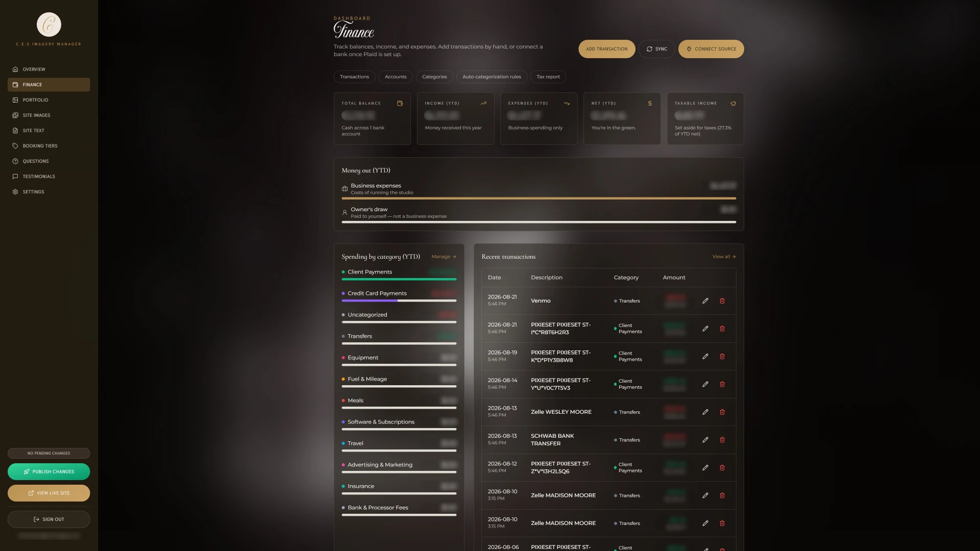
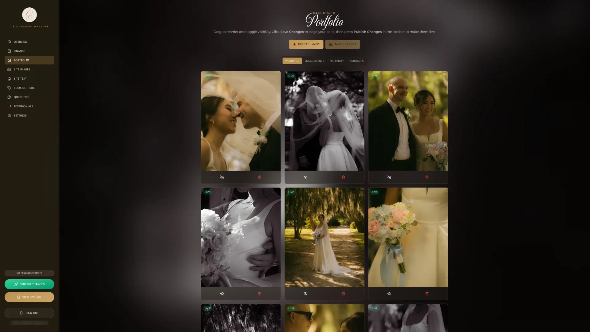
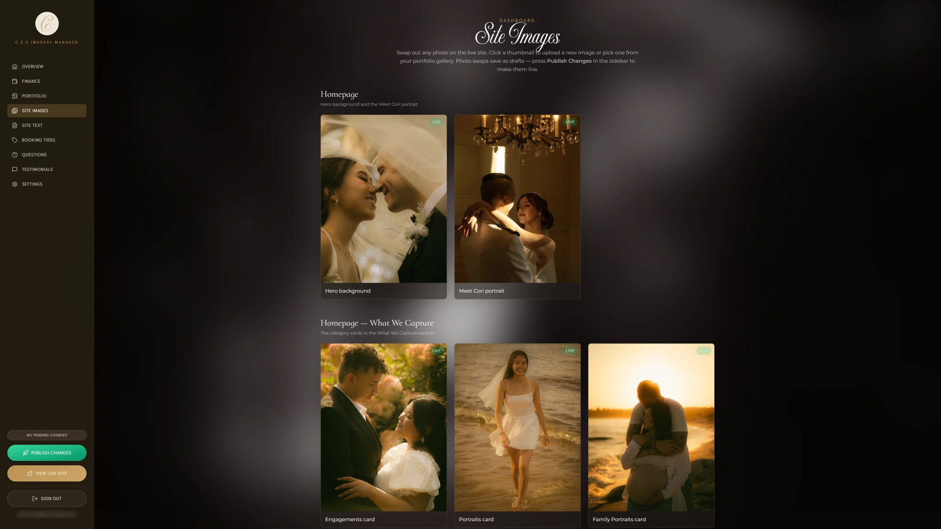
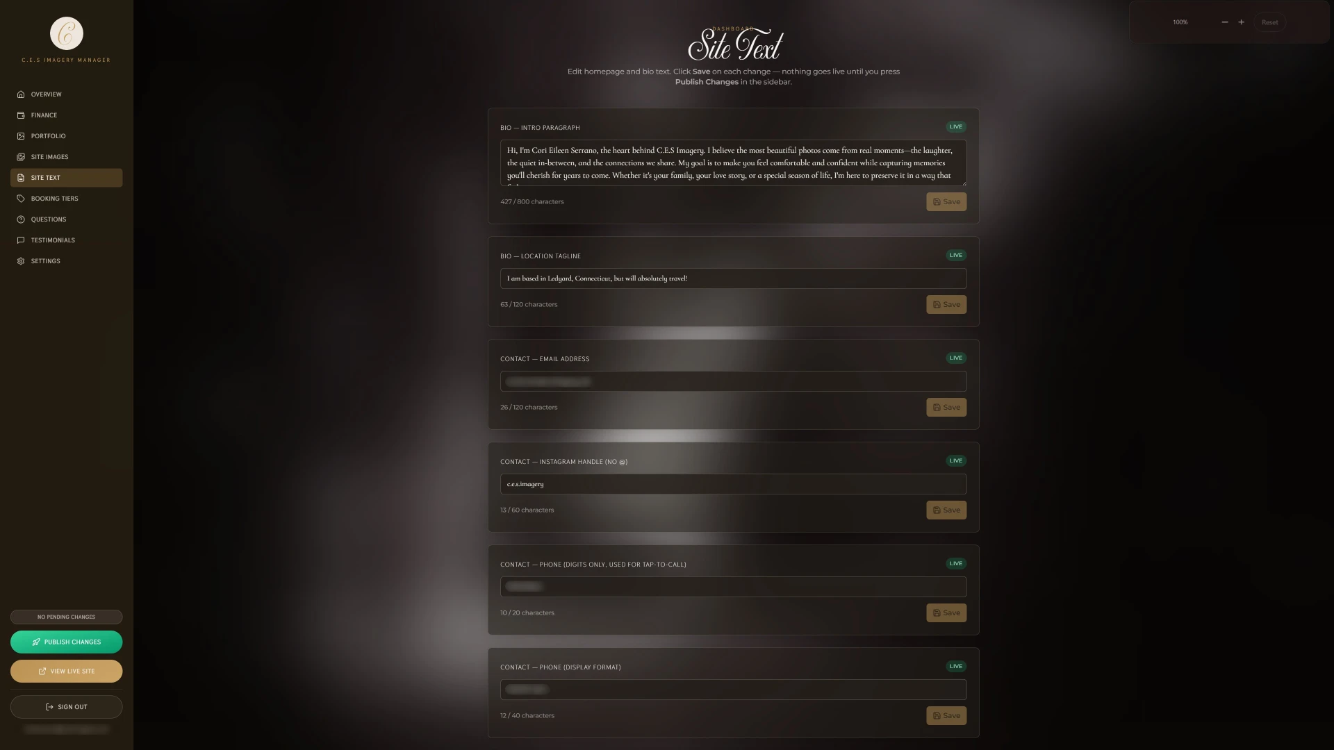
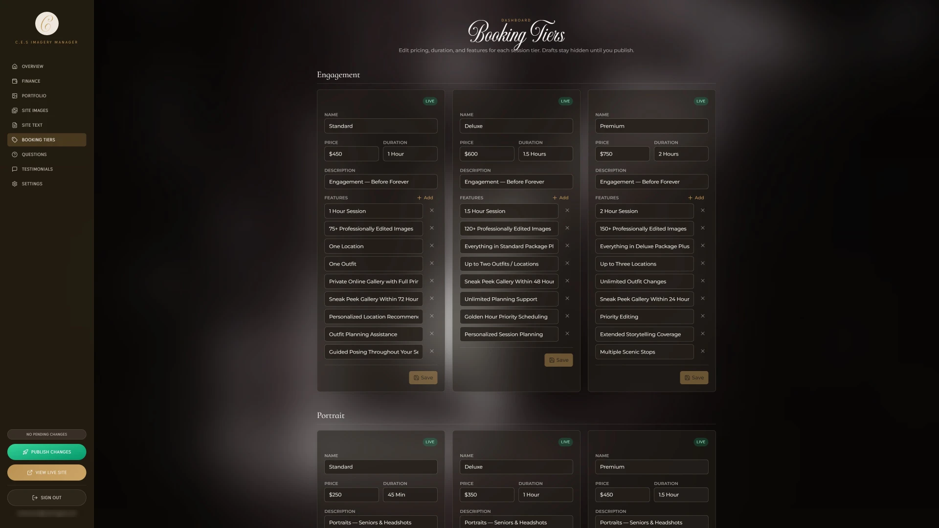
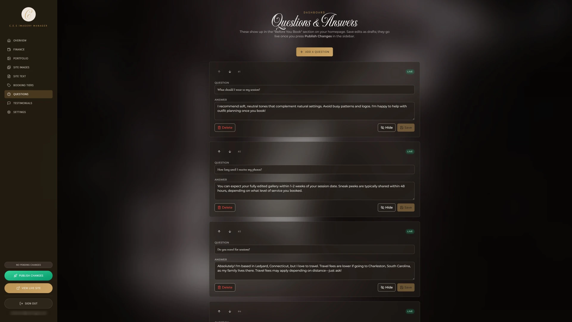
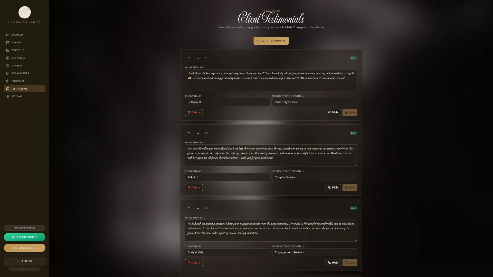
Alongside the site, I built Corbin a custom dashboard that puts full control of it in her hands. Three decisions shaped it, each answering a constraint from the start of the project.
Because
Her work changes constantly.
01
Sitewide image control
So
She can add, remove or swap images anywhere on the site and update any text, all without touching code.
Because
Corbin edits the site herself.
02
Version history
So
Every edit is versioned, so she can experiment with copy or images without fear of losing a version she liked.
Because
The studio started with no traffic, so there was no record of what visitors wanted.
03
Analytics built around sessions
So
Analytics show which sessions people browse before booking.
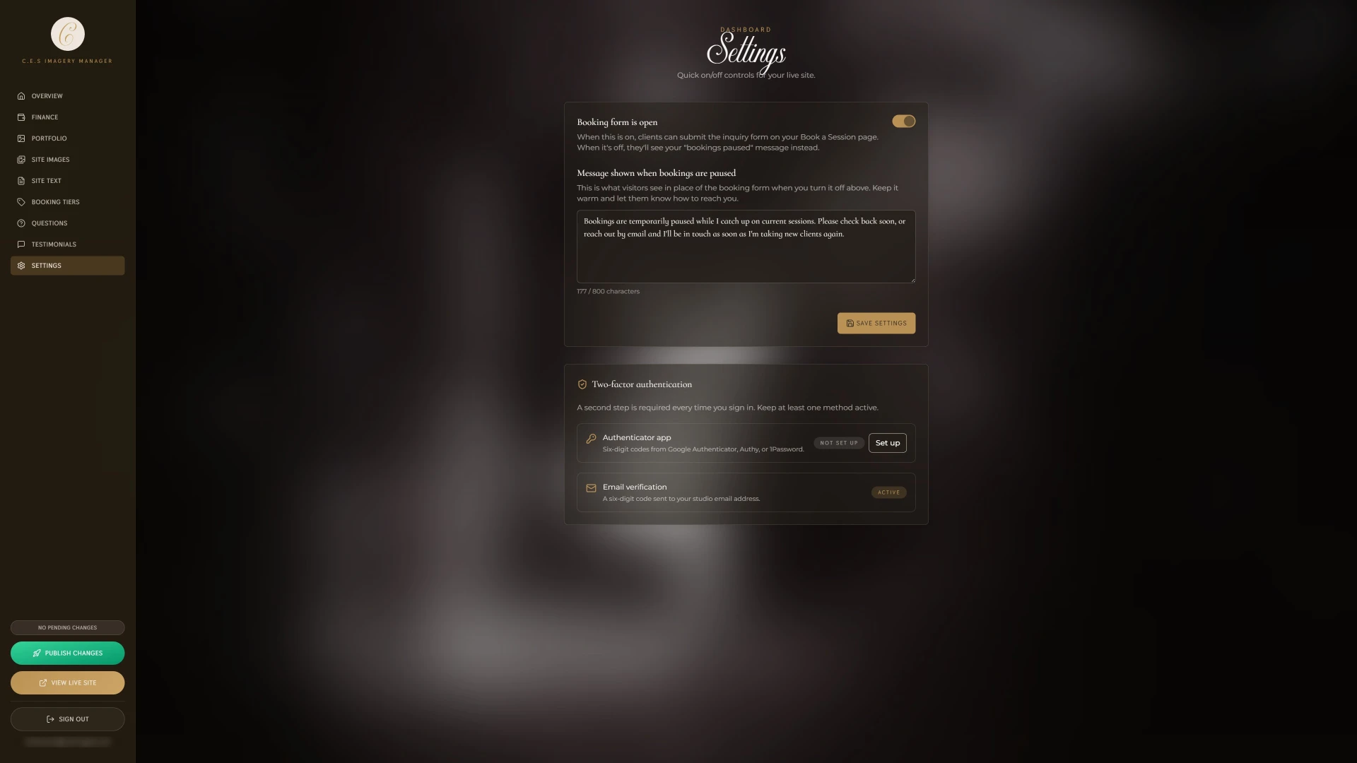
It also has a switch to pause new inquiries, plus direct messaging so client questions don't disappear into a personal inbox. A finance section connected through Plaid tracks her spending and invoices in the same place.
Corbin's dashboard sits behind its own login with two-factor authentication. It runs on the same Catalyst Digital platform as every client dashboard, and the walkthrough below is a live demo of that platform, so you can try it without seeing her data.
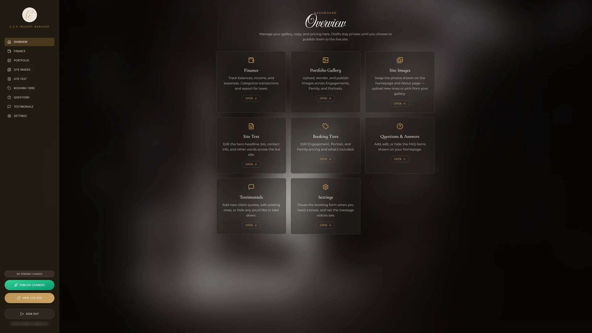
Dashboard screenshot 1 of 9
Since Corbin had no prior website, there was no existing search presence to inherit or fix, so I built structured data and AI visibility into the new site from day one. That includes JSON-LD schema markup for LocalBusiness, ProfessionalService, and Photograph entity types, along with areaServed and knowsAbout properties covering nine Connecticut service areas and every offering she provides. Open Graph and Twitter Card metadata control how the site appears when shared, and Offer schema marks up pricing directly for search engines to surface in rich results.
This project had two sets of users: the clients booking sessions, and Corbin, who runs the site day to day. Before launch, she tested it herself and had friends try the booking flow. Most of the evidence came after launch, from how her clients started finding and booking her.
There was no formal testing round, so the clearest signal is behavioral: clients changed how they find and book Corbin. For a site built to turn visitors into bookings, a change in where bookings come from is the most direct result.
“Working with Silas was a fantastic experience! He took my vision and turned it into a polished, professional website that perfectly represents my brand. He handled every request with precision and delivered everything on a quick timeline. I highly recommend his services!”
 Corbin SerranoC.E.S Imagery
What the work taught me, and what I would do differently with the next one.
I came into this project with a different direction in mind, and learned to prioritize Corbin's vision for her brand. Business owners bring strong conviction to what they do, and building trust with them is part of the design process.
Corbin and a few friends tried it before launch, and clients have used it since, but I'd want structured sessions with people who have never met her, watching where they hesitate between tiers.
Corbin has asked to replace the single contact form and tier selector. The next version gives each service its own subpage with dedicated imagery and a tailored contact form, so every client type books through an experience built around their session.
The site is hers now, and the next version is her idea.
Each case study breaks down the problem, research, design decisions, and outcomes behind the final product.

Redesign for a Charleston Legal Association

Recipe Discovery and Sharing App

Interactive US Travel Planner
What I design to
Loading previews…
30-second previews courtesy of Apple Music.
Open the full playlist on Spotify (opens in a new tab)