

Behind the Mark
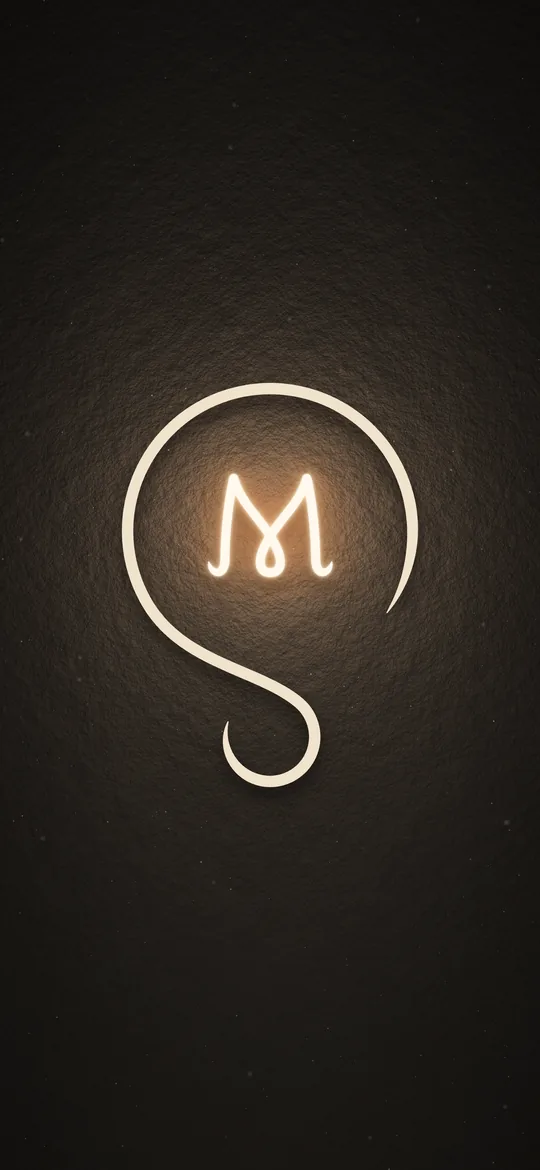
Why my logomark is a light bulb, and why the M inside it glows.
It starts with why
Everything I design is built from questions.
Product design, UI/UX, logos, packaging: all of it starts with a why. I wanted to put that one word into a single symbol, and the closest thing I found was a light bulb. It's the picture everyone already uses for having an idea.
I'm always asking why, about the designs I make and the ones I look at. When those questions get answered, the bulb lights up. That's why the M glows.
Two letters, one mark
I looked everywhere for logomarks built from an S and an M and found very few that felt balanced. The letters kept fighting each other. So I put the M inside the S, and that's where the light bulb came from.
Step 1
Side by side
S and M rarely balance next to each other. Every pairing I tried felt lopsided.
Step 2
The M moves in
Putting the M inside the S fixed the balance. The S curved around it like glass.
Step 3
A light bulb
The S became the bulb and the M became its filament.
Built on two circles
Everything in the mark lines up on two circles and one center line. Pick a part to see where it sits.
Why it glows
An old-fashioned light bulb glows because the thin wire inside it, the filament, gets hot. As it heats up, it glows red first, then warms all the way to white.
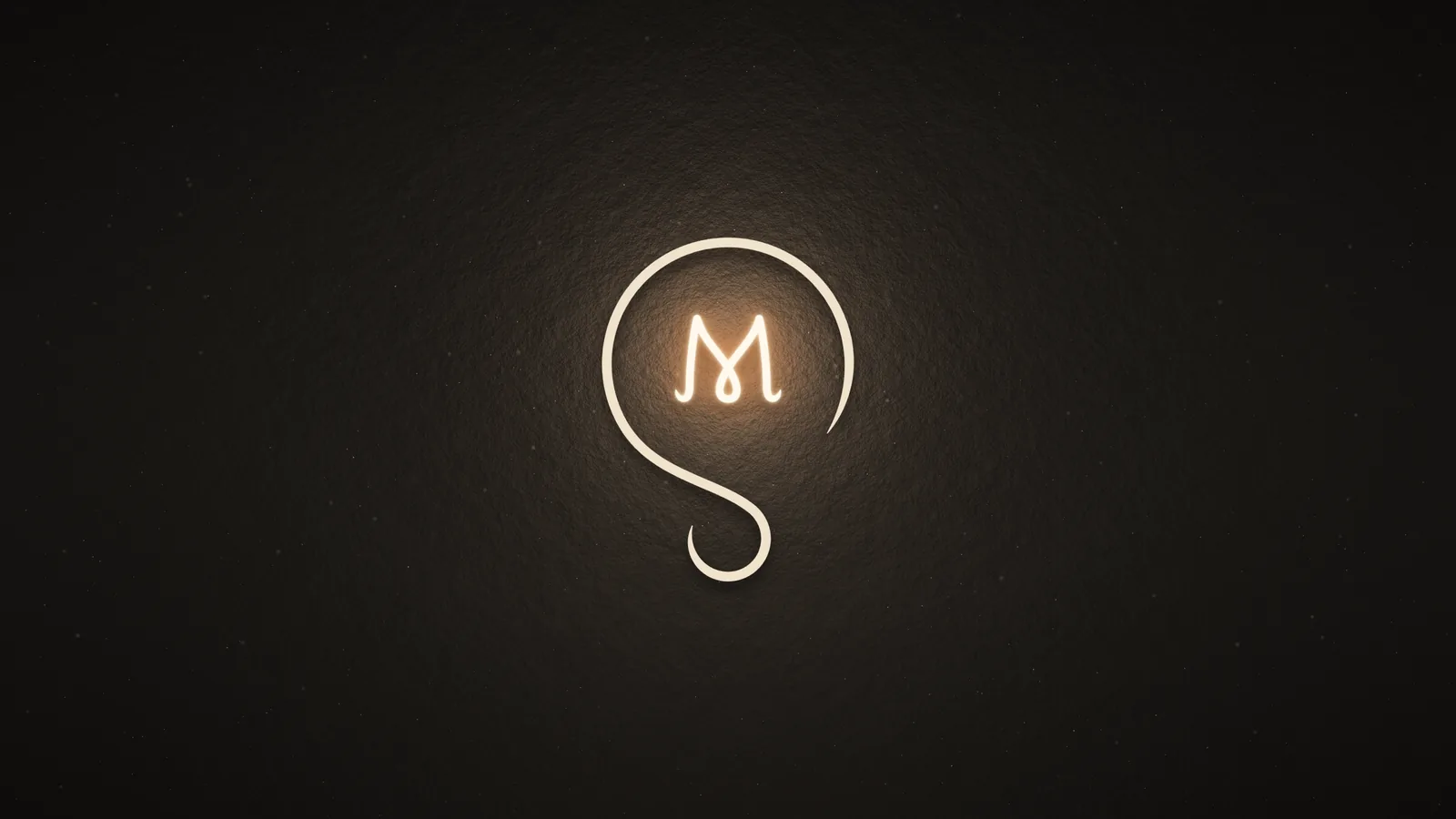
In my mark, the heat comes from questions. The more of them a design answers, the brighter the M glows.
Old bulbs also flicker for a split second when the power dips. The M does the same, so it feels switched on.
Off. The wire is cold.
Fully lit, the mark uses three colors.
- Filament#FFE9C7The lit M
- Glow#FF8024Around the M
- Bulb#F0E2CCThe S
Room to breathe
The mark needs empty space around it to read as a light bulb. The rule is simple: on every side, leave at least x, the height of the M.
Nothing goes inside that space. No text, no other logos and no edge of the page or the screen.
Four versions
One mark, set up for every background it might land on.
Primary mark
The default, used whenever nothing rules it out. The M is lit, with its glow and shadows.
Flat mark
A cream S and a filament-colored M with no glow or shadows, for places light can't render, like embroidery or print.
Monochrome
One color only: dark on cream, and cream on dark.
Combination mark
The mark with my name, for when people don't know it yet, like a resume header or an email signature.
Small or large
A logomark has to hold up as a 16 pixel icon in a browser tab and as something you'd print on a wall. Two circles and a single stroke weight keep it readable at every size.
16 px
Browser tab
32 px
Small icon
64 px
App icon
128 px
Print
256 px
Poster
Smallest size: 16 px tall on screens, 0.3 in (8 mm) tall in print.
The colors
Three colors carry the brand, all taken from a lit bulb in a dark room.
Black
#0A0A0A
- Its job
- The background for almost everything.
- What it means
- The dark room. The light only reads because of it.
Cream
#F0E2CC
- Its job
- The logomark. Also the thin lines between sections and the outline you see on hover.
- What it means
- The light of an idea switching on. Warmer than white, like a bulb at home.
Red
#91162A
- Its job
- Anything you can act on, and the page you are on. Used sparingly.
- What it means
- The heat behind the glow, and the push to fix what doesn't work.
The type around it
The mark is all curves. The Seasons, a high-contrast serif, carries the headings, while Cabinet Grotesk keeps longer text easy to read. My name is set in Medino, the same as the home page.
Headings
The Seasons
Body text
Cabinet Grotesk
My name
Medino
Out in the world
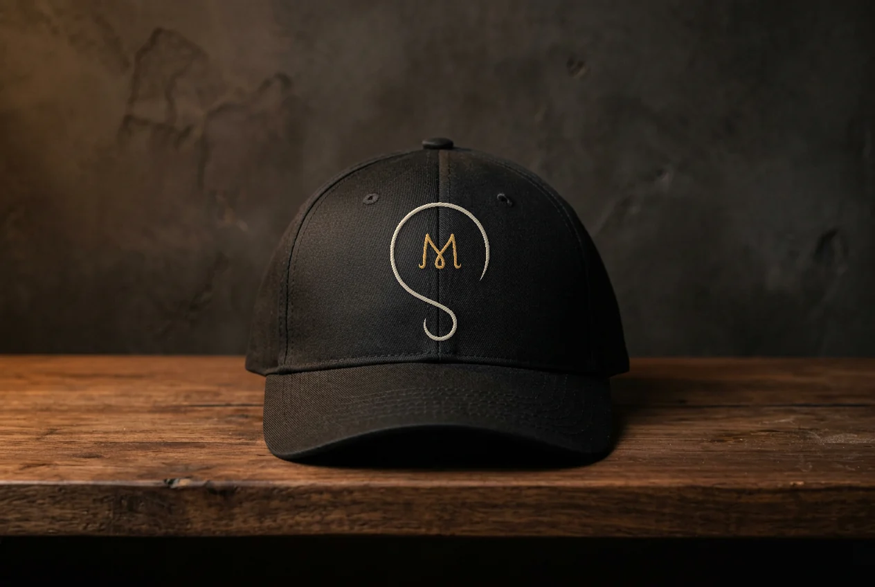
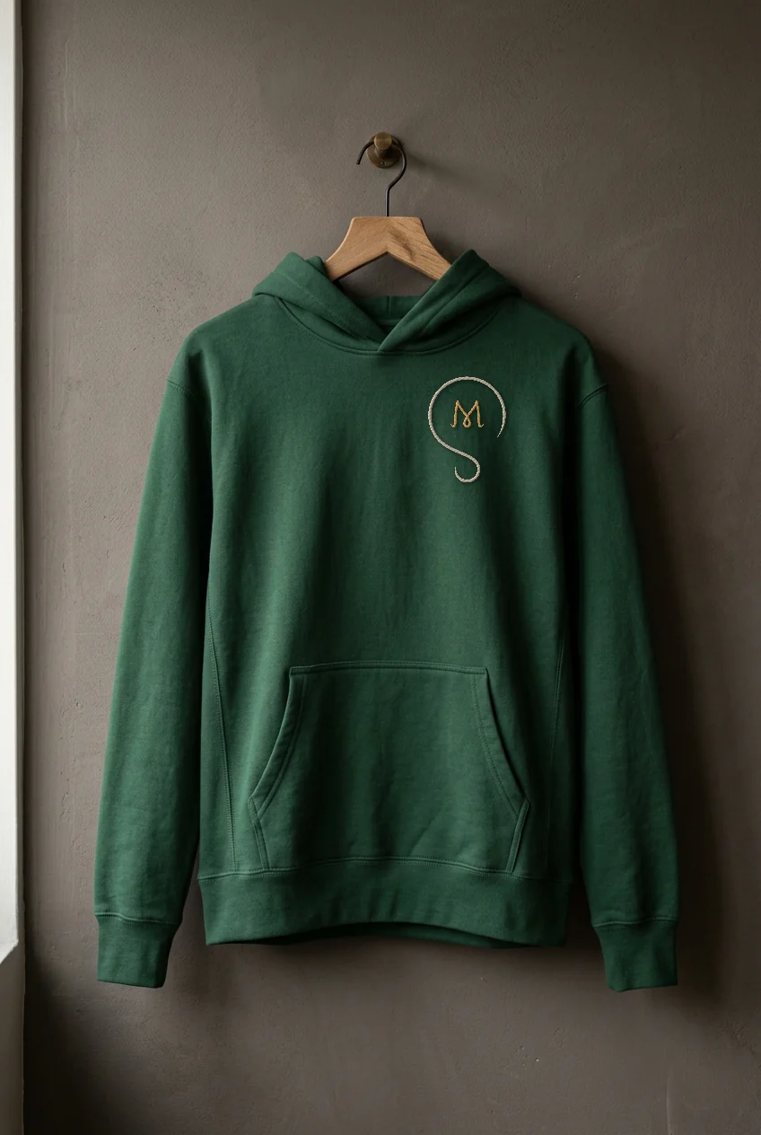
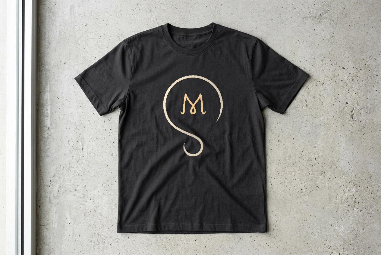
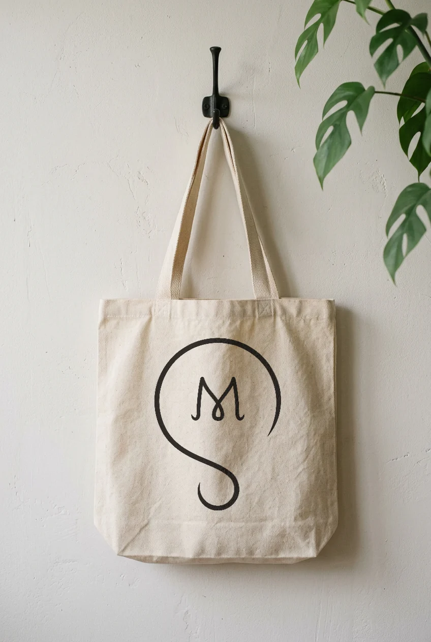
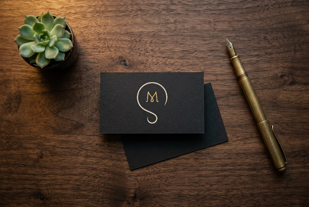
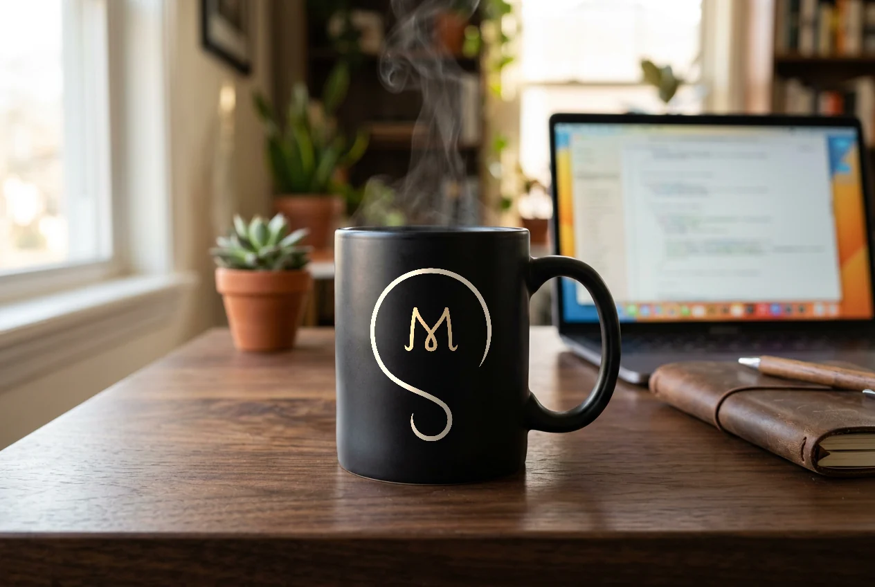
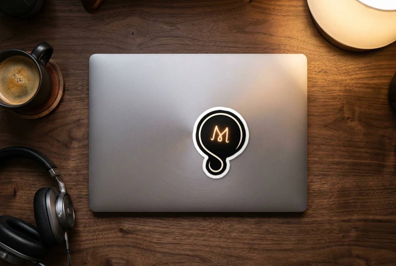
Mockups of the mark on things you can hold. The S stays cream, and the M switches to gold thread or foil, so it still reads as the warm part of the bulb without a light behind it.
The mark in use
On screens, the mark lives on my own setup every day: my monitors, my phone and the screen on my PC cooler.


Still asking why
This mark goes on everything I make. It reminds me to start every project with a question and to keep asking until the light comes on.