Warm-only
Flavor reads before type does
Keeping the whole range warm signals flavor from a distance, before any word is legible. Color temperature is the fastest signal a package sends, and it lands before the shopper decides to read anything.
Luma is a fictional functional sparkling water brand I created in my free time. It is a healthy, zero sugar, summery drink built around bright fruit flavor and an easy warm-weather mood.
Toolkit: Adobe Illustrator, Adobe Photoshop, Google Gemini, ChatGPT, Claude
Mango Hibiscus
Chilling the can…01 · The Brief
Luma started from a single idea: light. Everything else on the can reports to it.
I wanted a can that feels like summer: bright, warm and a little playful. Zero sugar shouldn't mean a dull-looking drink.
So the can leads with color. A gradient from mango gold to coral reads as ripe fruit, a pink drip pours over the top, and the rounded wordmark keeps it friendly. The goal was a zero-sugar drink that looks like something you want.
02 · Naming
Luma comes from lumen, the unit of visible light. The name stays abstract on purpose, so it can cover a range instead of a single drink: mango hibiscus now, something else next season.
“Taste the Bright Side!” turns the abstract name into a claim. It's set heavy enough to work as a secondary lockup, so it never reads as an afterthought under the logo.
The two are drawn as a unit and spaced as a unit. Anywhere the wordmark appears at size, the line travels with it.
A name that describes one flavor stops fitting at the second SKU.
03 · Color
Coral comes from hibiscus, gold and amber from mango. Every color is sampled from what's in the can.
Mango Gold#FFC857
Sunlit Amber#FBA45D
Ember Peach#F98B60
Hibiscus Coral#F45B69
White#FFFFFF
Every hue sits between 355° and 39°, a 44° slice of the warm half of the color wheel.
Warm-only
Keeping the whole range warm signals flavor from a distance, before any word is legible. Color temperature is the fastest signal a package sends, and it lands before the shopper decides to read anything.
Summer mood
Mango gold at the top fades through amber and peach into hibiscus coral, like a late-summer afternoon. The colors are bright and warm on purpose, so the can feels like a day off before you read a single word.
Headroom
Nothing in the system uses blue, green or violet, which leaves the cool half of the wheel open for new flavors as the line grows. The sixth SKU was planned for while designing the first.
04 · The Ownable Assets
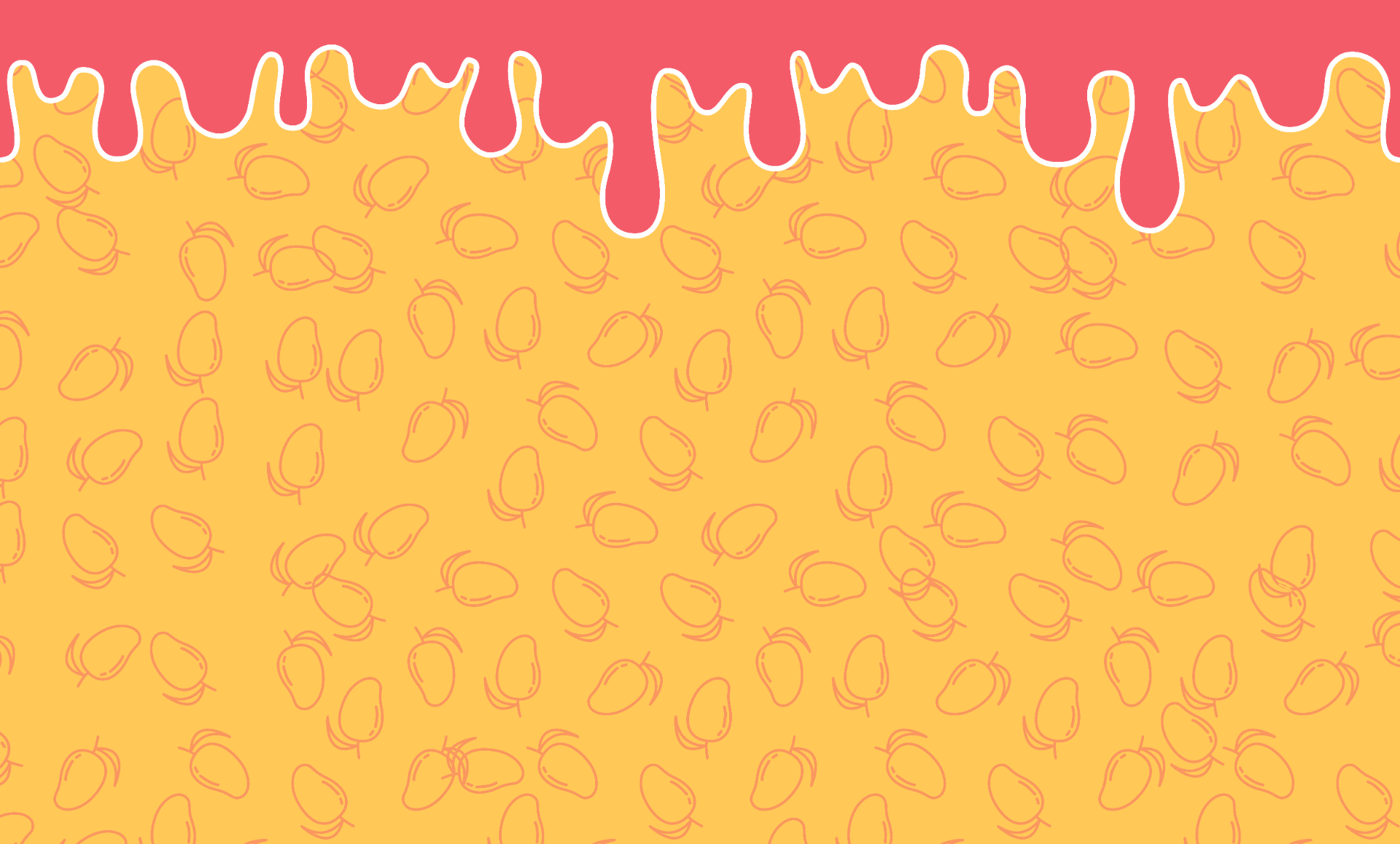
A wordmark tells you the name. A repeatable graphic is what people recognize. On this can, the drip, the mango pattern, and the gradient under them do that work.
The drip solves a production problem
The lid breaks any gradient that runs to the top of a can, so the artwork would just stop where the metal curves away. The drip gives the color a planned ending, and the eye reads it as a pour.
The pattern rewards a second look
The mango outlines are drawn at forty-five percent opacity over the same gradient that sits behind them, so they register as texture at arm's length and resolve into fruit only up close. A pattern loud enough to read instantly would compete with the wordmark for the first glance.
The gradient carries the flavor
Coral into amber into gold runs the full height of the can. It's the only element that changes between flavors, so the drip and the pattern carry over to every can.
05 · Proof
I photographed a soda shelf at Target, placed Luma in the empty slot under the store's lighting, then ran the whole shelf through three stress tests.
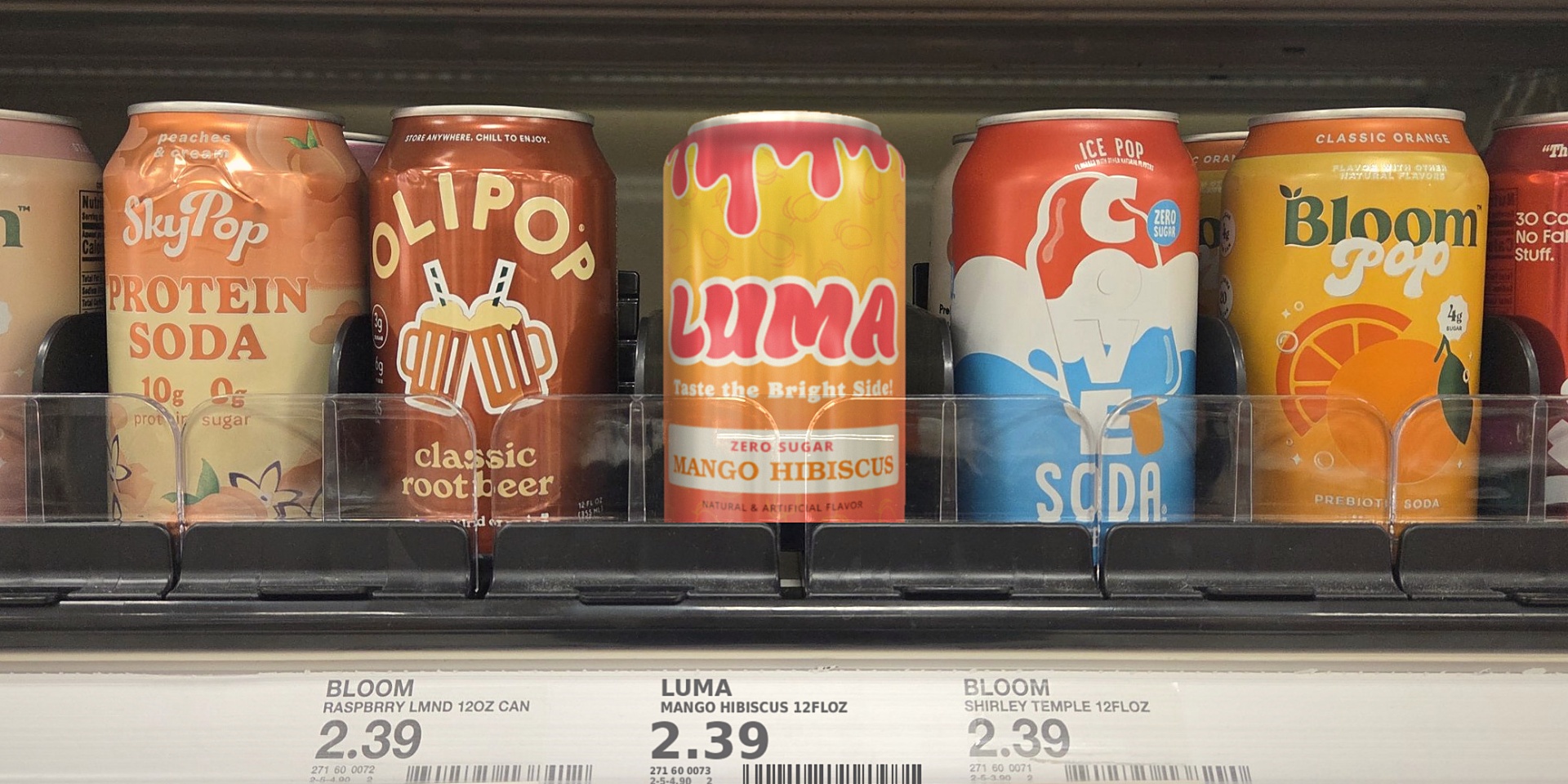
Shrunk to the size of a post in a feed, the type is gone. The pink drip and the white band still pick Luma out from its neighbors.
Without color, Luma is the lightest can on the shelf but also the flattest, and its wordmark nearly disappears into the gradient. The white claims band and the drip's keyline carry it.
Out of the corner of your eye, only color and shape register. Bloom Pop shares Luma's warm yellow, and the pink band of drips is what tells them apart.
The shelf challenged one assumption: Bloom Pop and SkyPop are warm too, so warm color alone doesn't separate Luma here. The drip identified it in all three tests, which makes it the asset to protect.
06 · Production
The dieline turns the label into something that can be printed and wrapped around a can.
Flat label, 1630 × 984 px. Wraps Ø66 mm × 122 mm.
Drag or use arrow keys to rotate
Seam at 0 mm of 207 mm
The artwork closes on a vertical seam. Drag the can and the join moves through the pattern without landing on a broken motif. That was planned from the start.
The lid curve cuts off the top of the gradient, which is why the drip exists.
The artwork has no bleed at either edge, so the wrap length is set by scaling the artwork. Scale it wrong and the legal type gets clipped.
Nutrition and legal copy sit inside the flat wall, clear of the shoulder taper where printing distorts.
These details don't show on the finished can, but the can can't be printed without them.
07 · Voice
The copy has to sound as warm as the can looks.
The line
Taste the Bright Side!
Three rules
Optimistic, with no baby talk and no winking.
Ten calories is a fact. State it plainly and move on.
The category treats ‘zero’ as a subtraction that needs justifying. Luma treats it as a given and spends the sentence on flavor instead.
One rewrite
Before
A deliciously refreshing zero-sugar sparkling water with natural mango and hibiscus flavor.
After
Every sip should brighten your day.
The first line lists ingredients. The second gives a reason to drink it.
08 · Accessibility
Accessibility usually comes up for screens. Packaging has the same obligation, and a can has no dark mode.
| Swatch | Pairing | Ratio | AA Large |
|---|---|---|---|
| #F45B69 | White #FFFFFF on Hibiscus Coral #F45B69 | 3.2 : 1 | Passes |
| #FFFFFF | Hibiscus Coral on White: ‘ZERO SUGAR’ | 3.2 : 1 | Passes |
| #D68000 | Flavor name #D68000 on White — ‘MANGO HIBISCUS’ | 3.02 : 1 | Passes |
| #2A2A28 | Black legal type on White — nutrition panel | 21 : 1 | Passes |
The one that failed
The flavor name was first set in Mango Gold on white at 1.54 : 1, which fails at any size. The audit caught it before the artwork was final. I kept the color family and looked for the brightest version that still passes. At 3 : 1 on white, luminance has a ceiling, so the question was how much saturation could stay under it.
The failing pair was fixed before the artwork was final.
09 · Extensibility
Everything that carries the brand works in any color: the wordmark, the drip, the pattern, and the claims band. Swapping the gradient changes the flavor and leaves the rest alone.
Juicy mango with a tart floral finish
Bright passionfruit with a crisp lime snap
Cool cucumber with a clean mint finish
Jammy blackberry softened by lavender
I set that rule before finishing the first can, because an identity that only works in one colorway can't extend into a flavor line.
10 · Reflection
What the work taught me, and what I would do differently with the next one.
I drew the drip because the artwork had nowhere else to end under the lid. The strongest element in the system came from a manufacturing limit, and that has changed how I start projects.
The flavor name failed contrast at 1.54 : 1, and I didn't catch it until the audit. I judged the swatch by itself instead of against the white band it would sit on. Contrast belongs to a pair of colors, so I now test pairs.
I photographed a real soda shelf and placed the can into it under the store's lighting, which is how the shelf test was run. A printed can on a physical shelf is still the test that decides whether it works.
The design is finished, but it still needs a test with a printed can.
Mango Hibiscus
Chilling the can…What I design to
Loading previews…
30-second previews courtesy of Apple Music.
Open the full playlist on Spotify (opens in a new tab)