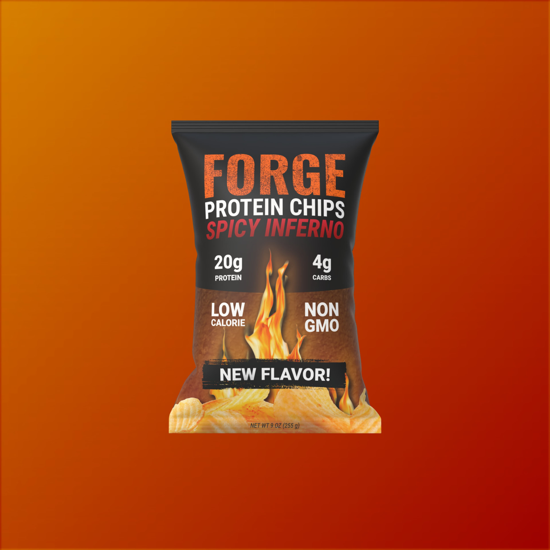
Forge Protein Chips packaging design

Forge Protein Chips is a high protein chip brand that came out of my own wish for a low calorie, high protein chip in a flavor I would actually reach for.

Toolkit: Adobe Illustrator, Adobe Photoshop, Google Gemini, ChatGPT, Claude

Interactive preview
Forge

Spicy Inferno

Firing up the bag…

01 — The brief

The Brief Was a Complaint

Forge started from a gap I kept running into as a shopper: I wanted a high-protein chip in a flavor I would actually reach for, and the aisle kept offering me neither.

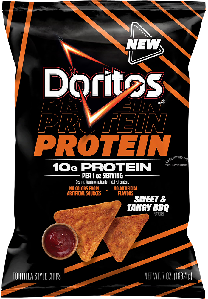
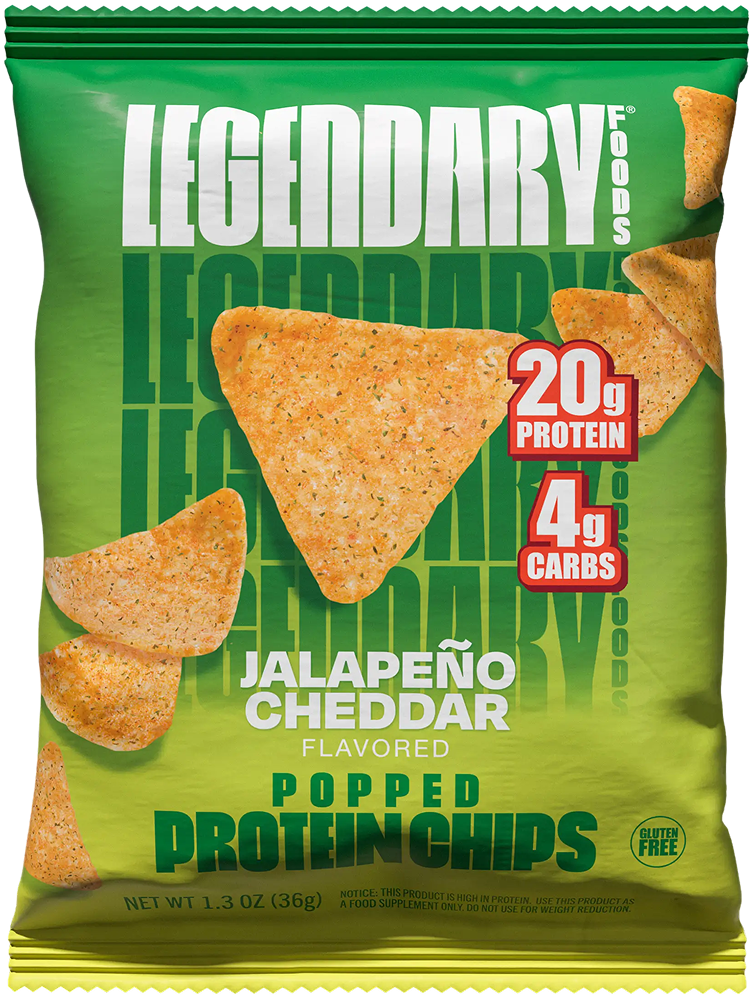
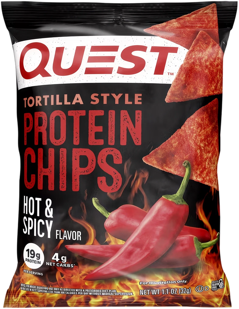
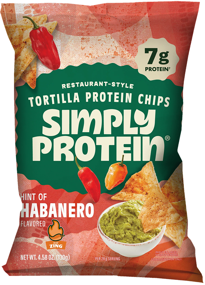
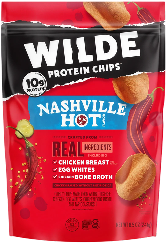
The protein-chip aisle is not quiet. Quest, Wilde and everyone beside them lead with heavy type, saturated color and a protein number set large enough to read from the next aisle over. The category is already shouting.

What it shouts is the same thing. Color is coded to flavor the way it is in the regular chip aisle — orange means nacho, green means ranch, red means barbecue — and the flavor names are borrowed from there too. The result is a shelf that is loud and nearly interchangeable, where the only real variable is which number is biggest.

Forge does not compete on volume, because volume is table stakes. It competes on material. A bag that looks forged and charred reads as a different kind of object next to flavor-coded brights, and committing to a single heat idea rather than a flavor wheel is what makes that legible.

Forge wordmark

02 — Naming

A Name That Hands You a Material

Forge carries metal, heat and formation. It gives the identity something physical to borrow from, which is more useful than a name that merely sounds strong.

Every surface treatment on the bag traces back to that single word. The eroded fill in the wordmark reads as cast rather than set. The scorched field beneath it reads as something that has been through fire. The heat gradient is the process itself, rendered as color.

That traceability is the test. A name either does structural work or it just sits on the front of the pack.

A name that only sounds strong gives the designer nothing to draw.

03 — Color

Heat as a Color System

The bag is read top to bottom, so the color heats up as the eye travels toward the chips.

Charcoal#0B0B0B

Inferno Red#BD131B

Scorch#823119

Ember Brown#6F3D17

Forge Orange#FF6A00

White#FFFFFF

Every chromatic value sits between 357° and 26° — a 29° wedge running from blood to ember, with charcoal and white doing the structural work.

Heat as hierarchy

Temperature is the hierarchy

Color does the ranking before type gets a chance. Charcoal holds the brand, the field warms through the claims, and the hottest value sits lowest, where the chips are. Nothing needs to be read for the order to land.

Against category

Material, not flavor coding

The category codes color to flavor: orange for nacho, green for ranch, red for barbecue. It is an efficient convention and it is why the shelf reads as one product in twelve costumes. Forge codes color to material instead — charcoal, ember, scorch — so the palette describes what the brand is rather than what is in the bag.

One job each

Every color is assigned

Orange carries the brand, red is reserved for flavor heat, white handles anything that must stay legible against both. Giving each color a single job is what stops a flavor extension from diluting the brand color.

Forge curved horizon, eroded wordmark and flame artwork

04 — The ownable assets

What Gets Recognized From Across the Aisle

A wordmark identifies. A repeatable asset gets recognized. Three things do that work on this bag — the curved horizon, the eroded type texture and the flame — and only one of them is the logo.

The horizon does the structural work

The sweep where charcoal gives way to scorched field is the bag's spine. It splits the pack into a claims zone and a product zone and gives the eye a horizon to travel rather than a hard rule to stop at. Cover the wordmark and that curve still says Forge.

The erosion is the material

The speckled break-up in the letterforms is not a texture applied for grit. It is the name rendered literally: type that reads as cast and struck rather than typeset. It survives at sizes where the flame has turned to mush.

The flame earns its place

The only photographic element besides the chips. It holds the center axis, supplies the vertical energy a bag of this proportion otherwise lacks, and ties name, flavor and heat cue into a single gesture.

05 — Proof

The Shelf Test

A bag that only works in a render is a bag that hasn't been tested.

Doritos Protein protein chip bag
Doritos Protein
Legendary Foods protein chip bag
Legendary Foods
Forge
Quest protein chip bag
Quest
SimplyProtein protein chip bag
SimplyProtein
Wilde protein chip bag
Wilde
Forge bag mockup thumbnail stress test

Thumbnail

At feed size the macros and the flavor name are gone. The charcoal-to-scorch block and the flame silhouette still read.

Forge bag mockup value only stress test

Value only

Strip the color and the hierarchy has to hold on value alone. The curved horizon carries it, because it was built as a value break rather than a hue break.

Forge bag mockup peripheral stress test

Peripheral

Peripheral vision sees blocking before it sees type. What registers is a dark top, a hot bottom and a bright vertical core.

Everything that survived all three is worth owning. The rest is detail for the person already holding the bag.

06 — Production

From Screen to Substrate

The dieline is where a layout stops being a layout and starts being a manufactured object.

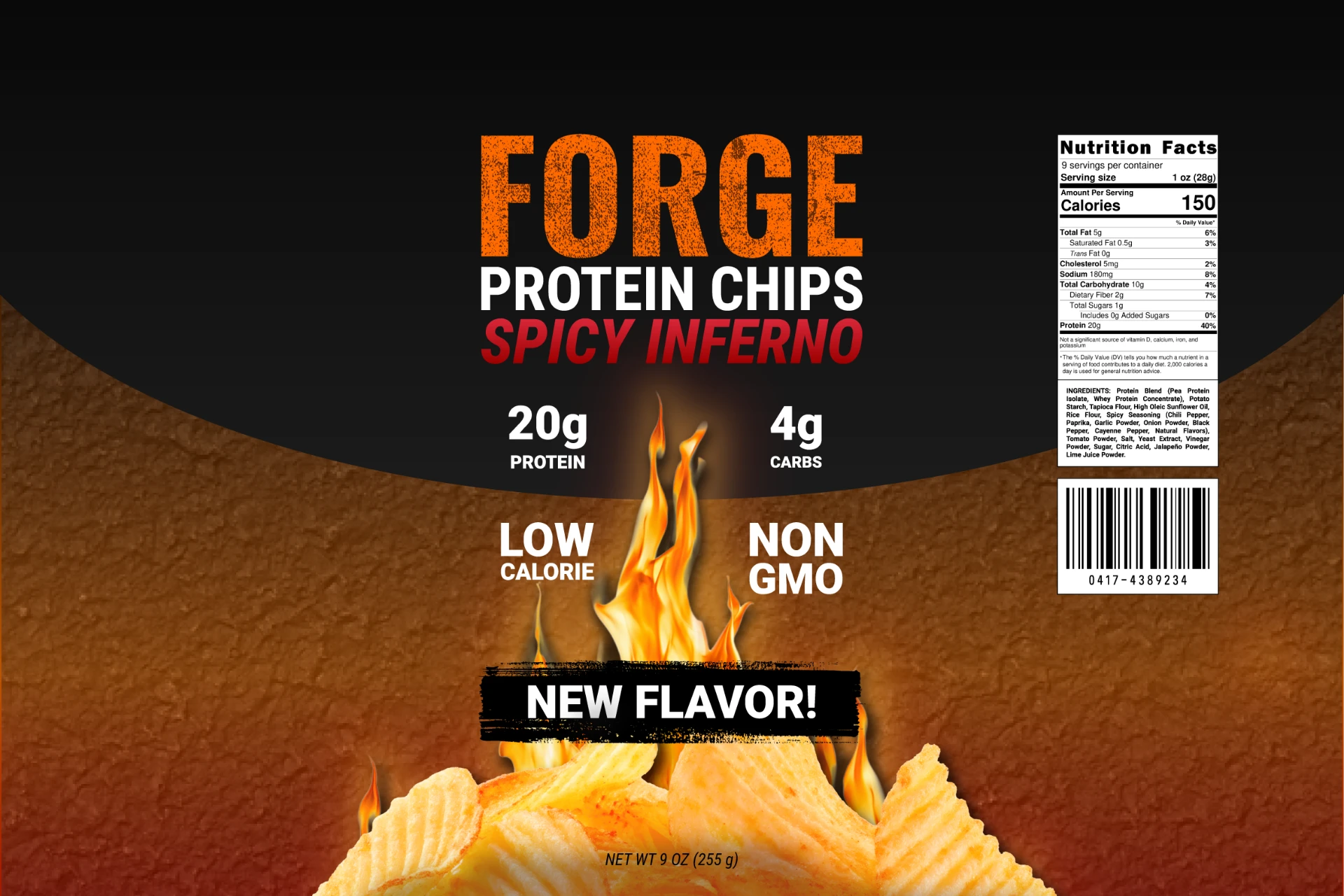
Flat artwork, 2363 × 1575 px — flow-wrap pillow bag, 9 oz

Back fin sealSafe zoneSafe zoneZero bleedZero bleed

Drag or use arrow keys to rotate

Seal at 0 mm of 320 mm

01 Back fin seal

The web wraps front to back and closes on a fin down the center of the reverse. Drag the bag and the seal travels through the field without ever landing on the nutrition panel — that clearance was planned, not lucky.

02 Crimped ends

Top and bottom are heat-crimped, which pleats the film and destroys anything printed there. The artwork is held clear of both crimp zones by design.

03 Zero bleed

The supplied artwork stops at the trim on both edges, so the web length is a scale decision rather than a crop decision. Getting it wrong clips the legal type.

04 Pillow distortion

A flow-wrap bag inflates. Type near the outer edges bows away from the viewer, so the macros and badges sit inboard where the film stays flattest.

None of this changes how the bag looks. All of it changes whether the bag can be made.

07 — Voice

Saying It the Way the Bag Looks

The palette makes a promise about heat. The copy has to keep it without hedging.

The line

Spicy Inferno

Three rules

01

Nouns before adjectives

‘Protein Chips’ states the category before anything tries to sell it. The shopper needs to know what it is before they can care what it tastes like.

02

Numbers do the selling

20g and 4g are the claim. No adjective improves a number, and every adjective placed near one makes it look less certain.

03

Heat is a promise, not a warning

The category hedges its spice with qualifiers. Forge names the heat plainly and lets the buyer opt in — hedging would insult the person reaching for a bag called Inferno.

One rewrite

Before

A deliciously crunchy high-protein snack with a bold, fiery kick of spicy seasoning.

After

20g protein. 4g carbs. Spicy Inferno.

The first sentence asks you to take its word for it. The second hands you the numbers and the flavor, then gets out of the way.

08 — Accessibility

Legibility Under Constraint

Accessibility is usually argued about screens. A package carries the same obligation with fewer excuses — there is no dark mode on a foil bag.

SwatchPairingRatioAA Large
#FFFFFFWhite on Charcoal #0B0B0B — ‘PROTEIN CHIPS’19.68 : 1Passes
#FF6A00Forge Orange #FF6A00 on Charcoal — the wordmark6.85 : 1Passes
#BD131BInferno Red #BD131B on Charcoal — the flavor name3.09 : 1Passes
#6F3D17White on Ember Brown #6F3D17 — the macro callouts8.91 : 1Passes

The one that failed

The flavor name is set in a vertical gradient, and gradients hide their own worst case. The average measured 2.9 : 1 — already a fail — but the darkest point at the bottom of the letterforms measured 1.37 : 1. Auditing the mean would have missed it entirely. The rule is to measure the worst pixel, not the average one.

Naming the weakness is the job. Fixing it before it ships is the rest of it.

09 — Reflection

Reflection

What the work taught me, and what I would do differently with the next one.

01

The object dictated the layout

The crimped ends and the back fin seal decided where artwork could live before a single element was placed. Designing the bag as a manufactured object first made the front panel easier rather than harder, because most of the bad options had already been removed.

02

I wrote the positioning before I audited the shelf

I started from an assumption that protein snacks look clinical. They do not — the category is loud, and has been for years. The real gap was not volume but material: everyone codes color to flavor, so coding it to a substance instead is what separates the bag. I reached that position by correcting a wrong one, and the order should have been reversed.

03

The system is untested until there is a second flavor

The locked and flexible zones are a claim I have made rather than proved. One more flavor through the same structure is what would show whether the split actually holds, or whether it quietly rebuilds the bag.

A system that has only ever held one thing has not been stressed yet.

Interactive preview
Forge

Spicy Inferno

Firing up the bag…